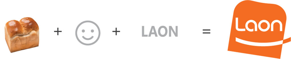
Founded in November 2016, laoncnb is committed to honesty and trust, continuously striving to produce high-quality, reliable confectionery, bakery, and desserts. In a competitive market, the company aims to lead by developing a global brand identity and strategic design marketing. To increase market share and maintain a competitive edge, laoncnb focuses on enhancing the brand value of its products and establishing itself as a powerful, growth-driving brand. This requires an integrated brand image strategy and differentiated visual identity to strengthen the company and product brand image.
Logo
Vertical Type
Horizontal Type
Using soft curves in smile and bread-shaped graphics, the design expresses the happiness and joy represented by "Laon." A consistent typeface and shaped symbols ensure readability and a unified visual identity.
Corporate
identity
Happiness
Healthy food
Trust
Laoncnb, representing happiness through food, promises customer satisfaction and joy by providing healthy and delicious products.
Design
concept
BI
Brand 01
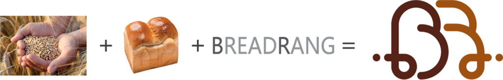
BREADRANG
The graphic starts from a dot (grain, soil, sweat), flows into a soft bread line, and returns to a dot (completion, customer), symbolizing nature’s journey to benefit humans. Upper and lower case letters are mixed in the typeface to maintain visual harmony and consistency.
Brand
identity
BreadRang, born from a single grain, a handful of soil, and a drop of sweat, always returns to its roots, upholding the basics of baking. It takes honest steps toward customers, being like a close friend, always nearby whenever called.
Design
concept
Brand 02
JIPGUBBANG
Jibgubbang refers to bread meant to be baked and enjoyed at home.
Brand
identity
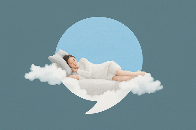
The concept of relaxation with Jibgubbang is represented by a symbol combining a comma and bread, conveying the story of “naturally thinking of Jibgu Bread at home.” Rounded typefaces and orange tones express warmth, vibrancy, and joy.
Design
concept
Brand 03
Kdelisse
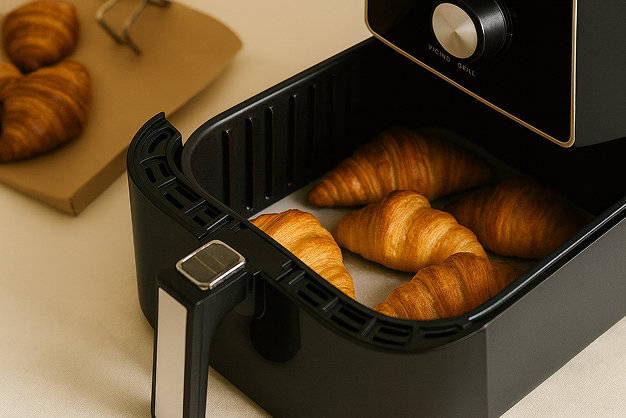
“Kdelisse” is a semi-processed frozen bakery brand for domestic and export markets, leveraging long shelf life, air fryer popularity, and cold chain technology. It targets single-person households, convenience food lifestyles, home cafes, and brunch culture, aligning with the global K-culture trend.
Brand
identity
The brand embodies the concept “4-Minute Magic: French-Style K-Bakery at Home,” reflecting the premium home café experience with frozen bakery products ready in 4 minutes without thawing. A dynamic ribbon represents global K-Premium, and a chef’s hat on the “K” emphasizes the baking concept.
Design
concept
CI
Overview
Founded in November 2016, laoncnb is committed to honesty and trust, continuously striving to produce high-quality, reliable confectionery, bakery, and desserts. In a competitive market, the company aims to lead by developing a global brand identity and strategic design marketing. To increase market share and maintain a competitive edge, laoncnb focuses on enhancing the brand value of its products and establishing itself as a powerful, growth-driving brand. This requires an integrated brand image strategy and differentiated visual identity to strengthen the company and product brand image.
Logo
Vertical Type
Horizontal Type
Using soft curves in smile and bread-shaped graphics, the design expresses the happiness and joy represented by "Laon." A consistent typeface and shaped symbols ensure readability and a unified visual identity.
Corporate identity
Happiness
Healthy
Trust
Laoncnb, representing happiness through food, promises customer satisfaction and joy by providing healthy and delicious products.
Design concept
BI
Brand 01
BREARANG
The graphic starts from a dot (grain, soil, sweat), flows into a soft bread line, and returns to a dot (completion, customer), symbolizing nature’s journey to benefit humans. Upper and lower case letters are mixed in the typeface to maintain visual harmony and consistency.
Brand identity
BreadRang, born from a single grain, a handful of soil, and a drop of sweat, always returns to its roots, upholding the basics of baking. It takes honest steps toward customers, being like a close friend, always nearby whenever called.
Design concept
Brand 02
JIBGUBBANG
Jibgubbang refers to bread meant to be baked and enjoyed at home.
Brand identity
The concept of relaxation with Jibgubbang is represented by a symbol combining a comma and bread, conveying the story of “naturally thinking of Jibgubbang at home.” Rounded typefaces and orange tones express warmth, vibrancy, and joy.
Design concept
Brand 03
Kdelisse
“Kdelisse” is a semi-processed frozen bakery brand for domestic and export markets, leveraging long shelf life, air fryer popularity, and cold chain technology. It targets single-person households, convenience food lifestyles, home cafes, and brunch culture, aligning with the global K-culture trend.
Brand identity
The brand embodies the concept “4-Minute Magic: French-Style K-Bakery at Home,” reflecting the premium home café experience with frozen bakery products ready in 4 minutes without thawing. A dynamic ribbon represents global K-Premium, and a chef’s hat on the “K” emphasizes the baking concept.